

Signage possesses remarkable effectiveness in conveying essential messages, capturing the attention of your target customers, and motivating them to take action. Whether it’s promoting a major sale at your clothing store, inviting people to an event at your restaurant, or encouraging sign-ups for monthly gym memberships, signage plays a crucial role.
However, it’s important to recognize that not all signs are equally effective. The impact of your sign largely depends on its design. If you aspire to create signs that leave a lasting impression on your customers and contribute to the accomplishment of your business objectives, consider following these three valuable signage design tips.
1. Creating contrast enhances the visibility of your sign design
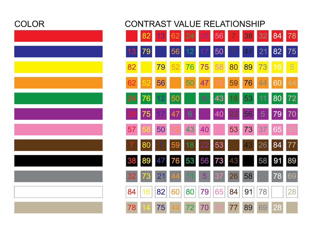
Incorporating contrast is a highly effective technique to ensure the easy and quick readability of your sign. For instance, avoid using complementary or similar colors in your sign design, such as orange text on a red background. Instead, choose color combinations that create a clear distinction, such as using red text on a white background, ensuring that the elements stand out distinctly.
A design with high contrast significantly improves readability, ensuring that your message grabs attention. As a general guideline, using a dark color for the background and a light color for the text (or vice versa) is the most effective way to create contrast in your signage design.
To show the significance of contrast in sign design, consider white text against a black background. The white text stands out prominently against the dark background, making the message significantly more readable.
Conversely, if navy blue text is used on a black background, the text will not stand out, forcing customers to strain their eyes to read it. When people are unable to decipher the message on a sign immediately, they are likely to ignore it, causing your message to be lost amidst other distractions.
Here are some color combinations that effectively create contrast in signage design:
- Black and white
- Blue/navy and white
- Black and yellow
- Green and white
You can also experiment with various design elements to enhance contrast and draw attention to specific parts of your sign. For instance, when designing a banner for promoting an upcoming sale, you can use a dark background with light text while incorporating a square with a light background and dark text to highlight a particular aspect of your message, such as a 50% off discount.
By incorporating visual contrast through the combination of light and dark colors, you not only capture your customers’ attention but also ensure that they can easily read and comprehend the message conveyed by your sign.
2. Visual hierarchy guides readers to prioritize information
Ensuring that your customers can read your sign is crucial. However, how they read it is equally important, and this is where the concept of hierarchy becomes essential.
Hierarchy is a design principle that utilizes size and scale to communicate importance. In signage design, employing hierarchy helps guide your customers to read the most critical information first and emphasizes key elements in your sign.
Text size serves as a straightforward method to establish a visual hierarchy in sign design. The larger text naturally captures attention first, so the most significant part of your message should be presented in the largest font size. Subsequently, you can use smaller font sizes to convey less crucial details.
The placement and layout of text also play a vital role. In languages that read from left to right and top to bottom, positioning your most prominent (and most important) text at the top and gradually decreasing the size can effectively communicate the relative importance of each text element.
3. Readability ensures a clear understanding of the message
As previously mentioned, the ability of your sign to effectively communicate relies on customers being able to read its content. While contrast and hierarchy play significant roles in readability, there are other design elements that contribute to the overall legibility of your sign.
So, what are these crucial elements? Here are some design factors that greatly impact the readability of your sign and consequently, its effectiveness:
Font selection: Few design elements are as crucial as choosing the right fonts. The selection of fonts plays a critical role in the success of a sign. Certain fonts are more readable than others. For instance, a simple sans serif font like Arial is easier to read compared to a complex script or brush font like Pinyon Script – especially when customers are viewing your sign from a distance. To ensure maximum readability, opt for simpler font choices. If you do decide to use a script or brush font, make sure to increase the text size for better legibility.
Spacing: It might be tempting to fill every inch of your poster, banner, or sign with information. However, cramming too much content into your design can visually overwhelm viewers and make it harder for them to read. Embrace the use of space in your design. Crowded signs are much harder to read, so don’t shy away from ‘negative’ or ‘white’ space. Aim for around thirty to forty percent of white space on your sign’s surface to ensure that essential elements, such as your logo and message, stand out clearly.
Letter case: Using uppercase letters can effectively highlight specific words or phrases in your sign design, attracting attention to key elements. However, excessive use of all caps can actually hinder readability.
Letter height: The height of your letters directly impacts how easily your sign can be read. Taller letters enhance readability, particularly from a distance.
By paying attention to these design elements, you can significantly improve the readability of your sign, ensuring that your message is easily understood by your intended audience.
Conclusion
Designing effective signage goes beyond simply conveying information—it’s about creating an impactful and memorable experience for your customers. By implementing the principles of contrast, hierarchy, and readability, you can craft personalized business sign solutions that capture attention, guide viewers to key messages, and ensure clear understanding. Whether it’s a vibrant storefront sign, an engaging banner, or an eye-catching poster, these design tips empower you to create signage that stands out and delivers results, wherever your business takes you. With custom business signs, you can make a lasting impression and drive success in any location.