Windows 9 have been in the news now days with its new features that we have been missing since the release of Windows 8. What Microsoft has done to Windows 8 was, they removed the Start menu which we had since the decade and instead brought us all new Metro UI. The Start Menu that can be founded on the Windows XP, Windows Vista and Windows 7 have been gone. Just Whush! No element at all. And this was the big issue when Windows 8 launched.
To improve the scenario, Microsoft released an update to the Windows 8 known as Widows 8.1. Here they introduced the Start Menu button. But there was the same issue; we didn’t had the same start menu which we had on XP, Vista or 7. People moan for the Start menu to Microsoft and now finally we had the leak since there are many leaks on the web about the new Windows iteration known as the Windows 9.
Windows 9 was actually projected or demonstrated (whichever you prefer) some months back by the official Microsoft team in a developer preview. Since then we had many number of leaks and so on. We heard it from China which started the leak show of Windows 9 by a forum post and an image. Now the leaks are following our way to hit you with the information on the new next gen Windows 9. Let’s roll on the real topic now, we did lot of scramble so let’s hover.
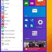
A German website WinFuture did the job of posting a video which is of 2 minutes (and the timing counts here) about the Windows 9 new interface and the new Start Menu button and how does it work. It is similar to the one which Microsoft showcased us with the new Live Tiles positioning and the modern app get mixed with the old style apps (the oldies actually). Talking about some of the features of the new Windows, the account option has been placed on top of the Start Menu as you can see it in the video.
Next to it you can see the shutdown option button which also gives you option to select the shutdown, restart with the sign out and Lock button. The new Start menu gives you two different pane views in which one on the left shows you the apps in a traditional way and the other on the right shows you the menu in the modern advanced way which also offers you live tiles over that. It is somewhat very similar to the Windows 7 Start Menu where users can close the modern menu and everything goes the old kind of way. The apps on the left pane become very similar to the older gen Windows where you can pin apps and also even browse the app list.
The Start menu on the right side pane gives you the feel of Windows 8 with Live Tiles and whenever you add an app to pin or pin an app to start menu, the Start menu keeps on expanding. The more you add pins the more it will widen up and also there’s an option to change the sizes of the app tiles. It could even be possible that Microsoft might remove the Start Menu and will only keep the Start menu Screen.
This means for people on Desktop will not have any Start Menu instead they will have a Start Menu Screen just like the old windows version. But things could change for the tablet users as the interface is not designed to run on the tablets. Tablets users might still have the Start menu. The Floating Apps works great and the new change which we can find on the modern apps is that, they will not only run in full screen but also would be resizable like the old apps used to run. So modern apps are basically taking shapes like how the old apps used to run.
Microsoft is planning to launch the new Windows Technical preview by the end of this month or the date could go to early October. Microsoft have not yet confirmed the naming scheme for the next gen Windows as this version just stands as the early phase for the Windows. It could be even possible that Microsoft would change the user interface also, but we would get the confirmation on that when we will see the next preview of the Windows 9. Let’s wait and enjoy the first release of the Windows Technical Preview.


