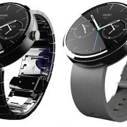
After the huge success of trendy wearable released by LG and Samsung, one more company is eager to initiate the market with the help of its first trendy wearable. Motorola’s Moto 360 is the talk of the town these days. Compare to LG’s G watch and Samsung’s Gear Live, Moto 360 is best looking Android wear. Moto 360 as the name suggests it has circular 360 degree design pattern and designer of Moto 360 says that they wanted to design an Android wear which should portray nothing but ‘Whoa!’ mark by user.
Moto 360 has stunning premium looks with genuine leather strap and marvelous circular glass design. We are going to explore each and every features associated with Moto’s new wearable and conclude whether it is true competitor of LG and Samsung.
Looks and feel:
If you had been through all the wearable in the market you will notice that Moto 360 is only Android wearable with circular design which actually looks like Analog watches. Out of box design concept of Moto 360 will definitely help it out to stand separate in the market. Not only the look of Moto 360 is amazing but it also has good built up material. Housing of the watch is made up of glass and steel and band or leather strap come from premium Chicago tannery.
Leather strap is lighter and soft compare to rubber band found in LG G Watch and Samsung’s Gear Live. Wearable should be given with leather strap rather than rubber band, leather strap looks premium as well as during sweaty condition it is more comfortable than rubber strap. Leather strap produces more flexibility and strength compare to rubber strap wearable.
Moto 360 falls on lighter end when it comes in measurement of weight compare to LG G Watch and Gear Live. Moto 360 weights 49grams whereas G Watch and Gear Live weights 63 and 59 respectively. Moto 360 watchband is available in variant colors like black, dark gray and light gray and you can interchange band easily with other. Moto 360 is well designed with 46mm diameter and 11.5mm thickness looks bigger and will not suit on every hands.
If you have muscular forearms then Moto 360 looks marvelous in your wrist but feminine hands will be smaller for Moto 360. Design of Moto 360 is very striking but from my point of view it is not suitable for every hand. To charge your Moto 360 you will need to charge it wirelessly with the help of Qi magnetic induction. Display shows the charging status and once you done with charge dock it off from magnetic induction.
Display:
Circular display of Moto 360 is out of the box design concept but practically speaking it is designed for a cause. Circular display of Moto 360 has pixels spread across surface with silver bezel around it. Circular face of the watch is all display which is an added advantage over other two watches in market. Moto 360 has display of 1.56 inch with 320X290 pixel resolution with pixel density of 205ppi.
Display is not sharp but still manages to produce good display unit with clear and colorful response. At one end of the circular display we see a black slice which spoils the circular perfection of display. Black slice is given for a cause, it has display drivers and ambient light sensor in to it and prevents watch to grow more thick in size. Smart move by Moto but it is very difficult to ignore that black slice on one end.
Ambient light sensor is included in Moto 360 and is the first watch to have this sensor. It helps the display of watch to auto adjust with brightness and backlit LCD of the display enhances the display features and make display readable under bright light. Sensor plays important role in Moto 360 because reading content in maximum brightness will eat up battery soon and here comes the works of sensor.
Moto has worked closely with Google to produce effective UI which is smooth and efficient to use. While scrolling through messages it cuts the edges because of circular display. You need to turn on the ambient screen from settings as it is off by default. To activate display you can press the button given on the side of the watch or you can just tap the screen or lift the watch and screen will light up. To have different watch face settings you can just press and hold the display and it will show up with different watch face. Dial face option is the best watch face as it displays time of two different cities which is helpful if you are working with global team.


